Planners: What am I using in 2019?

As much as I loved my Hobonichi I’ve used in 2018. I didn’t want to continue using it for 2019. The main reason was because of the price, at £40 I thought it was quite pricey to repurchase. Another reason was that I own two very beautiful Van der Spek planners, that I have not used at all this year. It was too much of a shame to leave them standing on the shelf. So I knew I wanted to go back to rings and use them.

Thinking over my Hobonichi I wanted to think what I liked about the planner and perhaps what I didn’t like. I decided that:

I loved:

  • The paper, Tomoe River Paper is divine.
  • I liked that everything was printed and bound, so it was there. I didn’t have to print anything out.
  • I liked the monthly layout.
  • The compact nature. Fit in some pockets, very simple to just take without a bag.
  • I loved the cover I had for it by Oberon Designs.

I didn’t like:

  • The lack of a weekly layout in the A6.
  • That I couldn’t use my VdS Planners.
  • The daily page, I tried to write every day as a journal. I liked that I could jot simple things and come back to it later, but the last two months or so I’ve ended up with a bit of a backlog. That’s more my fault. But I hated the waste of pages if I didn’t go back in and fill them. I also thought it was wasteful if I didn’t fill the page in.
  • Monthly overview at the start of each month, didn’t really use it.

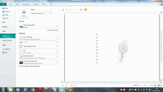
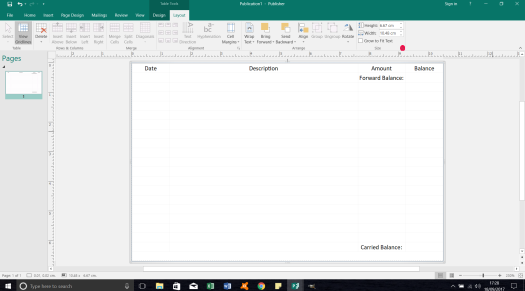
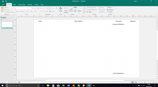
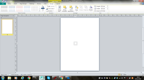
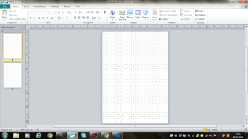
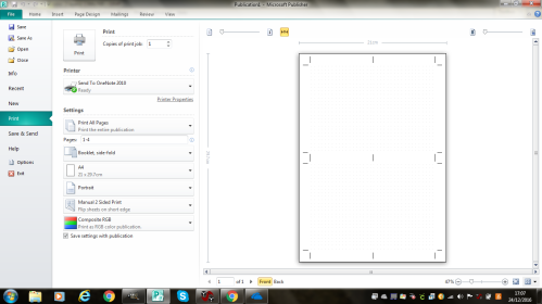
So the solution. I went into a VdS. As much as I loved Tomoe River paper, I already had a6 paper cut so I used that. I designed my own inserts on Publisher, but they have a heavy influence from the Hobonichi. My pages include:

  • 2019 yearly overview. No real reason why I have this. I don’t really use it. But I thought it was better than a blank page, as I needed the other side of the page to be part of the monthly spread.
  • The monthly spread.
    This is very Hobonichi. 8 columns. One column for each of the days of the week and the final column is blank. I will probably use that for monthly tasks or tracking orders. These pages go until December 2019.
  • 2020 yearly overview. Again same reason as the 2019 yearly overview, just to fill in a page.
  • Dates for 2020. I needed again to fill in a front page which would have otherwise been blank. I merged the four columns into so it’s a grided page, with the border around it so it matches in with the other pages. It’s just got the heading and it’s very plain so I can just write dates in I need it.
  • Weekly layout.

    This is the same layout as the monthly spread. It has 8 columns. One for each day, the 8th column is to balance it out so it’s equal for the two pages. If I am honest I don’t know what I am going to use the 8th column for. Could be used meal ideas, tracking water or exercise. Maybe some crafting ideas. What I also like about my weekly layout is I didn’t put the 31st December on the first Monday. It probably seems weird to everyone else, but I don’t like putting last year into my planner, even if it is 2018. The solution would be to have the year start on a Monday, but that’s so rare. So my first column just says happy new year. What’s important for me is that they are already printed out. So I have the whole year done. That’s what I liked about the Hobonichi, it was already done. So having done it now makes it less of a chore next year. The last page goes up to Tuesday 31st December and merged the last two columns to make a section for reflection on the year. Although it doesn’t have a complete week, that will go into a new planner.

I’m excited for 2019 to start using this. Yet there is a problem with it. A VdS planner is very bulky and I know that there are going to be times I don’t want to carry it around. I also didn’t want to waste my beautiful Oberon Design cover, which once the Hobonichi is used up, it probably wouldn’t be used anymore. I decided to use blank paper, hole punched and glued to a cardboard back. This will slot into the cover and I’ll use that for journalling, writing notes to people so I can ripe them off and leave them. This can fit in my pocket, I can copy notes from my planner into this and then copy information back.

Please excuse the poor lighting in my photos. Autumn decided to come!

Scaling Inserts: The Easy Way

This is not something I commonly need to do because I stick to one size planner. However there are several people in the planner community that will carry multiple planners. An on the go planner could be a mini or a pocket and then you can transfer finances into a larger personal or A5 planner which is a stay at home planner.  Steve emailed and asked for some help about creating one insert in multiple sizes and getting them to line up when printing. This question led me to thinking about the same insert and different formats and an easy way to do it – so I’m going to show you how!

Firstly create your insert. I am working with a mini sized template in Microsoft Publisher, so I used 0.32×0.32cm squares (the smallest square setting you can get) to get the feel of the layout and created an finance sheet that had the right proportions. If you need help with getting to that step try this blog post: Filofax: Make your own Inserts.


Scaling 1

Now open up another document and select a different size – for this tutorial I am going to use a personal size insert. You need to select the table, copy it and paste it into the new personal sized document.

Ctrl + A (Select all) -> Ctrl + C (Copy) -> move to new document -> Ctrl + P (Paste).

Now you need to lock the aspect ratio of the table. To do that you need to go to the layout tab and select the little arrow in the bottom right hand corner of the strip (it is highlighted in red on the previous post).

Tick lock aspect ratio -> Ok.

Once you’ve done that adjust the width of the table to the size you want. In this case I did 17.1cm to match width (I’m working in landscape mode) of the personal page.

Now 0.32cm is very small and now we have a personal we can afford to make that a little bit bigger. I counted the squares and realised I had 21 – so I deleted the bottom row to have 20 in total. I like to work with 0.5cm lines so I calculated how much that would be for 20 and it was 10cm. I unlocked the aspect ratio – the reverse of the previous step and changed the height to 10cm. This will make the rows taller whilst not changing the dimensions of the table in terms of column width.

Then I simple deleted two rows to give me space for my holes and allow it to fit on the page.

Scaling 2

I then made the writing a little bigger and I have my insert all ready to go.

To find out how to print it, check out my other post: Filofax: Printing your own Inserts.

Eye shadow and Lip Storage

I like makeup, there is something about putting it on and playing with colours that I find fun. For a while now though I have been reaching for the same palette over and over again, not because it was a favourite – although I do like it, but because it was easy to get to and use. My other eye shadows were in individual pots or other palettes and it was too much hassle to go through them and pick the colours I want. The same with my lipsticks. So I decided I needed to update my storage of both of them.

I ordered some mac palettes. I wanted a plastic storage – an upgrade from a fishing tack box I have been using for years. I would love to get another Unii palette but they have just disappeared! What happened to Unii palettes?

I needed some pans for my lipstick, but I also decided to depot my eye shadows and put them in the same size pans as the lipsticks. This was an additional step that didn’t really need doing, but I wanted clean pans that weren’t covered in glue from when I de-potted them from old palettes – I also like the uniform look of having the same pan size and shape throughout. I would have liked to have had square or rectangle ones but to get a press for them in the UK was difficult without paying a lot of postage. In the end I went for a 26mm – the same size as mac shadows. That was great because it allowed me to use my seal stamp and a 10 pence piece to press them. I also bought some 25mm labels so I could write what they were on the back. My stamp has hasa claddagh image and it was showing up a little when i stamped. I’d love to work on getting the image to come out clearer.

I wanted to fit as many eye shadows and lipsticks as possible into each palette so I opted to have the palettes without inserts because you can get more in. Now in order for these pans to stick in the palette and not move you need a magnet. I didn’t really want to put a magnet on the back on the pan so I bought a4 magnet sheets and measured and cut a rectangle of magnet so it could lie in the base of palette. I left a bit of a gap so I could pull up this layer in the future so I could clean it. You can see the magnetic sheet in the above picture.

I am very happy with my palettes and look forward to using more of my makeup.

Traveller’s Notebook: Make your Own Inserts

I’m going to have to thank Cheryl Payne for this tutorial. She emailed me a little while back asking for guidance on how to make traveller’s notebook inserts and she gave me a lovely compliment of saying my tutorials were easy to follow. So this is really for Cheryl (although I am sorry it is a little late!). I must start with a big word of warning – I don’t actually own a traveller’s Notebook so I have not printed these out or tested them. This is just a tutorial of how I would make them if I had a traveller’s notebook…

I’ll be making a simple dotted page for the passport size of notebook but first of all we need are trusted Publisher, so start by opening that up.

Start menu > All Programs > Microsoft Office > Microsoft Publisher

Next we need to create a blank template to the correct size, as it’s not standard you’ll need to create a new template. The first screen in Publisher should be the select your template.

Click More Black Page Sizes > Custom > Create new page size…

Width:8.9cm

Height 12.4cm

Margin guides – set all to zero.

I’m going to make this a dotted note paper and to do that I’m going to create a table that is 5mm x 5mm.

Insert > Table > 1×1 Table

Once the table is created

Double click the table > Change width and height to 0.5cm

tn1

You’ll need to insert 18 squares across the width of the page.

Right click the table > Insert > Right

Keep going until you’ve inserted 17. To speed up the process you can highlight multiple boxes and insert right. If you select three boxes you’ll insert another three.

Align > Align Right

Will set your table to the right side.

Next we need to create 25 rows.

Right click the table > Insert > Below

This will create a slightly bigger table than the height of the page. Don’t worry about that.

Now we need to create the dots. Click the mouse to the first cell. Then go to the main task ribbon.

Insert > Symbol > Middle Dot (Character Code 00B7) 

Copy and paste the dot into each box by highlighting the first cell and pressing Ctrl + C and Ctrl + V. Once you completed the first role you can copy and paste the dot into each row.

Once each box has a dot in you have completed the page. You can then duplicate the page by.

Right clicking page 1 on the left hand side of the screen > Insert Duplicate Page

tn2

Now this is just a basic template you can jazz it up and get as fancy as you want with it. Just remember that a traveller’s notebook consists of four sides to one sheet of paper. To help explain this a bit better take a scrap of paper and fold it in half. There are four faces to the book. When printing faces 1 and 4 (the front and the back page) will be printed together and faces 2 and 3 will be printed on the back. It doesn’t really matter how they are printed in this tutorial, but it is more important when you design your own layouts. A trick to making it easier for you is to select the select the printing option of Booklet side-fold, as this will calculate the order of the page for you when printing. For a more in depth look at printing inserts please read my original post. The only different would be not to cut the centre crop marks but to merely fold the page over. If going more complicated layouts it’ll be a good idea to think of margin spaces to the left and right of each page as a fold may effect template design. I’d aim for a margin of about 2-3mm.

tn3

I hope this helps anyone looking to make your own TN inserts. If you have any question please feel free to add a comment below.

Ostalgie

Ostalgie is a very whitty pun and a merging (well really it’s dropping of a letter!) of two German words Ost, meaning east and Nostalgie, meaning nostalgia. It is a term that is used to refer towards showing sentimentality for the east, particularly for the Deutsche Demokratische Republik, or as we called it, East Germany.

In 1989, The Berlin Wall fell and Germany ceased to be two divided countries and reunited into one. Although it was seen as a victory for the West, it was often quite traumatic for those living in the East, especially as parts of their cultural identity had been stripped away. This led in part to a turning back to the DDR with fondness and nostalgia. Today, elements of DDR life such as TV Shows (such as Unser Sandmännchen), Food, and the Ost-Ampelmännchen (The green man on crossing signals) still play a part in daily life.

I have a friend who was born in the DDR and still lives in former-DDR territory. He is a die-hard lover of the DDR and he jokes that he hates leaving the DDR to go to the West. Over Christmas, he went home to his Mum’s house and showed me some old coins and DDR maps that he had. I adore old coins and maps and I saw these and instantly decided I wanted to get a DDR map and some coins and join the Ostalgie bandwagon.

I was able to pick up some lovely items.

First is a 1 Pfennig coin dating from 1961. This was the year the Berlin Wall was established. I thought it would be perfect to set it in a coin mount and have my own lucky penny necklace. At first I couldn’t find a coin mount to fit with the standard English penny coin mounts, but luckily I live in Birmingham, home of the Jewellery Quarter, so I was able to find someone to make me a bespoke one. I really love this necklace.

image

Second, I found a 1990 5 Pfennig coin, this one is slightly bigger than the 1 Pfennig, and 1990 marks the final year these coins were made. This one sits in my Filofax. I don’t really have a set use for it, but like some of my other coins I collect, they are just nice to pull out occasionally and look it.

image

image

Finally I have this beauty, a wonderful map of Berlin, complete with red line marking the Berlin Wall and a little icon for the Brandonburg Gate. My absolutely favourite feature of this though is the refusal to even draw West Berlin on the map, leaving it instead blank. Under the Hallstein Doctrine, West Germany had refused to acknowledge the existence of East Germany as a separate country. In addition, any country that formally recognised East Germany and established connections with it, would be denied diplomatic relations with West Germany. Although by the time this map was created the Hallstein Doctrine had been abandoned in favour of Ostpolitik, relations between East and West were still frosty. Hence the refusal to acknowledge West Germany on a map. I am currently looking into a frame so I can hang this map up on my wall.

image

image

image

image

image

Making Dividers part 2

So in my previous post I discussed making dividers. This is a follow-on post which will show you how to print cut and laminate them.

Option 1: Cardstock

Cardstocks are some beautiful designs and they can look really great. The easiest thing to do is to go to a local craft shop and have a look at different cardstocks. I recently went to Hobbycraft and picked up a beautiful Christmas themed pack for another project. Cardstock books have themes that will complement but you can mix and match with different card you find in the store. They’ll hopefully be a lot of choice. I am using my cardstock for a different project but it is so beautiful I may make some dividers with it at some point.

Now you make your divider you can take an existing template, if you have ones that came with your filofax/planner. If not you can take a template of a page and draw round it and add a tab if you want one. You can also draw one onto the card with a ruler and have the outline that way. Once you have a template to follow simply cut them out.

image

Option 2: Printing from Publisher

If you are printing on a personal sized template page to get crop marks you’re going to want to make sure you have crop marks selected, you are also going to need to onset your pages a little to make sure they line up. My previous printing post has a very good step by step guide, so please go and read that one to set it up properly.

If you are working on a4 paper it should be really easy to print. Just select to print double sided.

Ctrl + P > Make sure landscape is selected > change print one sided to Manual 2 sided Printer flip sheets on long side. 

Printing is printer specific so it’s best to experiment a little with how your printer prints thinks. To save ink you can do this in black and white or work on just putting shapes or words on a publisher page – to save wasting ink.

Once printed it’s time to cut them. I recommend a stanley knife, cork board ruler and a cutting mat. It’s cheaper than a investing in a guillotine. Now you want to have a nice clean edge without any white on it, so it’s best to place the ruler on the white next to the divider and cut. I normally prefer to rest my ruler onto the colour/printed image and cut away from it, but with dividers it’s better to see the print so you can see if you’ll get any white showing, rather than not trim enough. It can be hard to tidy up with a stanley knife as I’ve found it tears, so it’s a good idea to get it done in one cut.

image

Laminating

Now is the fun part, well it’s not really fun, I just find laminating therapeutic/fun, I don’t know why. I got my laminator on Amazon. The one I got had a recommend retail price of £50, I got it on sale so it was much cheaper than it was listed on at the moment (I got it for less than £20, it’s currently at £26.50 19/12/2015). There’s nothing special about this one it doesn’t have a heat setting to turn it up or down or do anything fancy. It works well but you can probably get a cheaper one, this was just a really good deal when I got it. I use Textet Laminator Pounches, I really like this set as a starter set. They have a bunch of different sizes so don’t have to buy a ton of different packs to get a variety for different project or wait to have enough to laminate. These have a nice thickness to them and they make my dividers feel sturdy but don’t add loads of bulk to my planner.

I recommend working on your cutting mat. Place the laminating pouch on the mat and open it – they can be quite prone to causing static so it can be a bit fiddly. Place your items on the sheet, you need a good balance between filling it to not waste the laminating sheet and allowing a gap between the images. It’s good to have them on a cutting mat because it’ll limit the chances of the divider moving when you pick it up – and risk them sticky. It happened with my sticky notes.

Plug your laminator in and allow it to reach temperature. When ready gentle slide the sealed edge towards the edge of the cutting mat. Lift the mat and feed the sealed edge into the laminator. Keep the mat steady as the sheet feeds into the machine. Went until all the laminator has gone through before removing the mat – this will save dividers moving. Once laminated you can leave the item to cool again.

image


image

Now you can cut your dividers again. My laminator is good enough that I don’t have to leave a sealed edge so I try to minimise that as much as possible, but it’s personal taste. I recommend leaving an edge for my reuseable sticky notes for cleaning them. If you did your dividers the same size as pages leaving the edge with a laminator will make them a bit bigger. Once cut you can punch them. If you’ve not labelled your tabs a great way to keep them usuable is to write on them with a pen like this. You can wipe it off and rename the tab later if you wish.

This is my current front page and it makes me smile!

image

Making Dividers part 1

I think dividers are the biggest way you can express yourself with a planner. They can really bring your personality into your planner. This is just a blog post about how I made mine, I use a graphic design package to make them and I go a little fancy to tie them together. It’s a great way for you to personalise them and add your name etc, but if you are not so confident using design software, skip to ‘Option 3’ and follow from the publisher selection. If you really don’t want to print your own.

History plays such an important role with me that I had to bring that into my planner. The first thing I did was a tried to find images I liked, most of these were images I had already. Most of these come from previous google searches, so I collected them and I opened them up in Gimp (or publisher if you are following Option 3).

Option 1: Cardstock

By far the easiest way to make your own dividers is with cardstock, it’s the one most people do. I wanted mine to be a little more personalised so I made mine like below. However these are still a great option. I will discuss how to make these in part two, as it fits in more with cutting and laminating then it does with creating and printing.

image

Option 2: Gimp 

Gimp stands for GNU Imagine Manipulation Program. It works like Adobe only it’s completely free for a full program (or at least it was when I downloaded it was free for a complete program). If you know how to do this you can skip this tutorial and go to my cutting and laminating post instead.

The pictures themselves don’t really have a theme to them so I wanted to try and tie them together a bit more. I googled and picked a nice looking vintage old paper texture. This will be a base where I’ll ghost the images on top of. Now I made a decision that I did not want the traditional tab on them. I love these images so much that I didn’t want them in a particularly order in case I changed the order and pick a different one for a front cover.

Firstly, create a blank Canvas.

File > New > Switch px to mm

Width: 95

Height: 171 (if you want tabs, add an extra 5-6mm on to these numbers, there are just for personal size. You can also generally add an extra 2mm or so if you want your divider to be bigger than your normal page).

It doesn’t really matter what background colour you have. I normally leave it on white.

Next you need to copy and page your old vintage this will act as a background. You’ll get a new layout pop up in the layout option but it’ll be called a floating layer selection, you need to change this to layer.

Right click the Floating Layer Selection > To New Layer

background.png

Repeat this step again for the image you want. Then I’m going to ghost the top image (in my case a DDR Map of Berlin).

Layout toolbar > Mode: 

You’ll get a bunch of different options that come up. Play around until you find the one you like best. Once you are happy with it you need to merge down the layers.

berlin

Layer > Merge down

Now if you wanted to add tabs, you have a view options you could do. You could either leave the image as it is, print it out and then cut the tabs by eye. Or you could set up guides to space out the tabs and then cut away the image. You can write on them if you want as well or if you want to potentially change their purpose you can leave them blank. I am in the process of ordering some sticky tabs so my dividers can be repostionable. Once you’ve added your tabs, if you are going to you can now copy and paste this and put it into publisher. I really like publisher for printing my documents as I love the print preview and crop marks. It’s a very user friendly piece of software

Option 3: Publisher

In my previous posts with publisher I have worked on personal paper, if you have a white divider that would be difficult to cut out without a guide – you’ll need crop marks; follow this tutorial to get your dividers ready for printing. If not I recommend working on an A4 page so you don’t have to worry about printing both sides the back side precisely.

File > New > A4 landscape

For once I’m going to leave the margins on as I don’t want to run the risk of my printer not printing part of the image (I don’t have a colour laser printer so I took these to University to print so I wanted to make sure they wouldn’t screw up). Copy and paste the image into your a4 page. Now you can fit up to 3 personal sheets onto one a4. So you can put at least one more if not two. I decided to space them out and just do two.

together

Next add a new sheet and copy your original vintage paper template to this page. Make sure it’s large enough that it will cover your divider images.

background1

That concludes the tutorial on how to make them. Next post will be about printing and laminating them.

The Reusable Post it note!

Someone, I can’t for the life of me remember who posted an ingenious idea on the Philofaxy facebook group a little while ago. There idea was for a reuseable shopping list that you could just rub off and reuse. Think of it. You just literally need one shopping list then instead of throwing it away and having to print out a new one or storing several you just used the one you had. What a great idea. It got me thinking with my recent post it notes. So to the unknown person, I salute you.

So my idea is basically the reusable sticky note. If you’ve not already done so check out my blog on how to make your own ones. But if you have a sticky note you really like, you’re running low on and you don’t think you’ll be able to re-buy it or you have a some nice paper you want to use whatever this is a great idea.

So what you need to do is select your sticky note or something similar. Cut it to size and laminate it. Then cut it out. You have your reusuable sticky note. I use Staedtler Permanent market I got from ebay. I got the fine, but if I was to repurchase I’d probably go for the superfine.

Next up I took my dashboard that slots between my week on two pages and got some double sided sticky tape. I stuck it to the back of the sticky note and then to the dashboard. Now it’s a permanent reusable sticky note. If you wanted something less permanent you could use blu-tack, paperclip, magnet – whatever you want.

image

It’s really cost effective – I had everything on hand as it was and so far I’ve used them multiple times. I really like using the green to do today sticky note. I find my long list of bullet to dos quite daunting. But picking a few out for a daily to do list that I can work on motivates me a lot more to complete my to do list. I then rub it out for tomorrow and repeat. Had I have had a regular sticky note I probably wouldn’t have used them because I hate wasting paper unnecessarily.

Now to remove the pen you can either use a rubber which leaves a residue on your post it or you can go straight for the nail varnish remover which will get rid of both the residue and the ink. Rubber is obviously better for on the go – and safer on your manicure.

My one tip would be to make sure you be careful when cutting out your post it note. I’ve noticed I’ve nicked the laminate seal on one of my post its. So when I use nail varnish remover  on it it soaks the paper. This isn’t that much of an issue but it is leaving a little bit of liquid damage everytime I clean it – and a bit of a mark. It’s not very noticeable but I imagine over time it will limit the life of my post it.

Now at the moment I carry three post it notes instead of a whole pack and just need to carry an extra pen and a rubber. I also don’t have to worry about constantly buying post it notes or reprinting my to do post its. It’s great. I recommend you give it a try.

Also I have since found out that the target to do sticky notes I really love aren’t that great at sticking…so those lucky enough to have them…why note laminate them and use some double sided sticky tape on them. They now are not only pretty but practical now.

In addition why not have some fun and take some images that you like and laminate them, they could be anything you would like. Here are some I’ve been working on for my 2016 diary.

image
Various images from Berlin, Munich, Vienna and London.

DIY Post it notes

I covert the beautiful target sticky note:

il_570xn-791194852_28uvI really wanted a sticky note that looked like that. A check list where you can actually tick things off. I tried and failed to find one I liked in the UK. I eventually gave up but remember seeing a video from Kent from Oz about Printing your own sticky notes.

The video is here:

So I watched it and came up with my own solution for how to do it, it’s very similar to Kent’s but I did do a few changes so I thought I’d share my version of it.

Firstly I do it in Publisher, it’s a program I use for all my inserts. I opened up a blank a4 portrait page. I took a ruler and measured the size of my sticky note. I then inserted a table the exact size as my sticky note. In this case it’s 7.5cm x 7.5cm. I put a black border around my table and I centred it to be in the middle of the screen. I ended up with this. very similar to Kent’s video.

square

This is where it changes slightly. I then created a new blank page and created another table exactly the same size and put it in the same position; only this time I didn’t put the black border around it. I then drew a design I wanted on my post it note.

peacock

I then lined up my sticky note onto the sheet I had printed out and experimented with my printer. If you have an up and over printer like I do then you’d like the paper in your tray with the sticky note face down with the sticky part facing closest to you. Then you print and voila you can a pretty printed sticky to do note without having to pay a fortune shipping them.

Now you can create as many on the page as you want as long as you position them in line with you template that is fine. I know this was a slightly more OCD way to do it – now I know my design is going to be dead centre. I hope you too can also get some beautiful sticky notes even if you don’t live near a target!

image
This is one I tried and ended up getting the sticky note the wrong way round!

Filofax: Printing your own trifold inserts

So my last post on Friday was about how to make a fold out monthly insert…and now I’m going to show you how to print them (apologises if you’ve been trying to work out how to do it all weekend as this post went out on Monday…). Anyway, if you want to know how to make them you can read that blog here.

In the post I showed you just a basic design…I customised mine to my own style – namely German font and pictures from German history and a bucket list…so my finished product will look like this:

january
february

Now to print I recommend just focusing on page at a time, once you’ve set up and printed the first one and it’s gone ok you can print the others off very quickly by just changing the numbers on the Print Custom Range.

Firstly check the print preview and make sure everything looks ok, my checklist includes:

  1. Number order
  2. Spelling errors
  3. Where are the punched holes going to go? Did I mess that up?
  4. Is everything between the crop marks?

If you’ve not got crop marks you can add them:

Click the down arrow on your printer (just above printer properties) > Advanced Output Settings > Marks and Bleeds > Allow bleeds > Crop Marks

Next we’re going to set up the page.

Print Custom Range > Relevant page numbers (3-4 in my case) > One page per sheet > A4 > Manual 2 Sided Print (Flip sheets on long edge)

Now just hit the front and back on your print preview make sure it looks ok. Now hit print. If like me you don’t have a duplex you’ll have to manually change the paper. Don’t click the pop up box that comes up. You’re going to have to work out which way round to load your paper, this is mostly trial and error. If you have an up and over one like mine you lie the paper print side up with the text on your left hand side.

image

image

Then you just need to cut and punch. I recommend cutting on the first page side (in this case the January or the odd month). I find cutting on the other side can get it out of alignment a little bit (damn A4 and the inability for it to be 29.8!). To fold them you need to keep in mind that you’re rings are going to take up space so you can’t do a straight forward fold. One think to do is punch the holes first. I flipped my page over so I was on February. Folded the end which had the calender on it up to the bullet points of the bucket list. I then flipped it over and folded it back on itself until it there wasn’t anything over hanging on it.

image

There you go. Revel in the fact you can now see your month and weekly at the same time.