I think dividers are the biggest way you can express yourself with a planner. They can really bring your personality into your planner. This is just a blog post about how I made mine, I use a graphic design package to make them and I go a little fancy to tie them together. It’s a great way for you to personalise them and add your name etc, but if you are not so confident using design software, skip to ‘Option 3’ and follow from the publisher selection. If you really don’t want to print your own.
History plays such an important role with me that I had to bring that into my planner. The first thing I did was a tried to find images I liked, most of these were images I had already. Most of these come from previous google searches, so I collected them and I opened them up in Gimp (or publisher if you are following Option 3).
Option 1: Cardstock
By far the easiest way to make your own dividers is with cardstock, it’s the one most people do. I wanted mine to be a little more personalised so I made mine like below. However these are still a great option. I will discuss how to make these in part two, as it fits in more with cutting and laminating then it does with creating and printing.

Option 2: Gimp
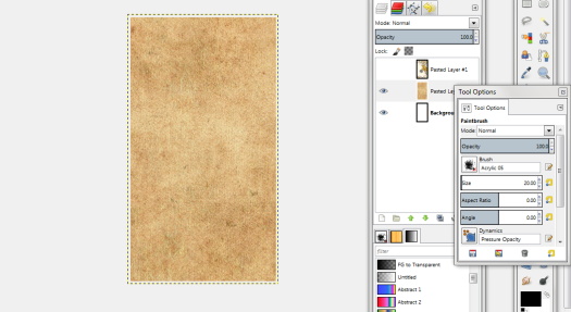
Gimp stands for GNU Imagine Manipulation Program. It works like Adobe only it’s completely free for a full program (or at least it was when I downloaded it was free for a complete program). If you know how to do this you can skip this tutorial and go to my cutting and laminating post instead.
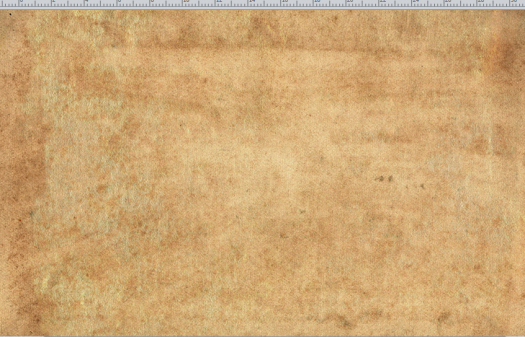
The pictures themselves don’t really have a theme to them so I wanted to try and tie them together a bit more. I googled and picked a nice looking vintage old paper texture. This will be a base where I’ll ghost the images on top of. Now I made a decision that I did not want the traditional tab on them. I love these images so much that I didn’t want them in a particularly order in case I changed the order and pick a different one for a front cover.
Firstly, create a blank Canvas.
File > New > Switch px to mm
Width: 95
Height: 171 (if you want tabs, add an extra 5-6mm on to these numbers, there are just for personal size. You can also generally add an extra 2mm or so if you want your divider to be bigger than your normal page).
It doesn’t really matter what background colour you have. I normally leave it on white.
Next you need to copy and page your old vintage this will act as a background. You’ll get a new layout pop up in the layout option but it’ll be called a floating layer selection, you need to change this to layer.
Right click the Floating Layer Selection > To New Layer
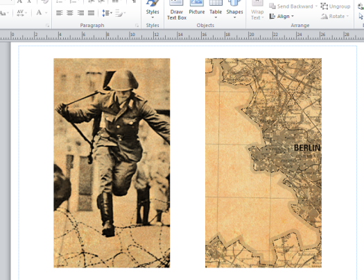
Repeat this step again for the image you want. Then I’m going to ghost the top image (in my case a DDR Map of Berlin).
Layout toolbar > Mode:
You’ll get a bunch of different options that come up. Play around until you find the one you like best. Once you are happy with it you need to merge down the layers.

Layer > Merge down
Now if you wanted to add tabs, you have a view options you could do. You could either leave the image as it is, print it out and then cut the tabs by eye. Or you could set up guides to space out the tabs and then cut away the image. You can write on them if you want as well or if you want to potentially change their purpose you can leave them blank. I am in the process of ordering some sticky tabs so my dividers can be repostionable. Once you’ve added your tabs, if you are going to you can now copy and paste this and put it into publisher. I really like publisher for printing my documents as I love the print preview and crop marks. It’s a very user friendly piece of software
Option 3: Publisher
In my previous posts with publisher I have worked on personal paper, if you have a white divider that would be difficult to cut out without a guide – you’ll need crop marks; follow this tutorial to get your dividers ready for printing. If not I recommend working on an A4 page so you don’t have to worry about printing both sides the back side precisely.
File > New > A4 landscape
For once I’m going to leave the margins on as I don’t want to run the risk of my printer not printing part of the image (I don’t have a colour laser printer so I took these to University to print so I wanted to make sure they wouldn’t screw up). Copy and paste the image into your a4 page. Now you can fit up to 3 personal sheets onto one a4. So you can put at least one more if not two. I decided to space them out and just do two.
Next add a new sheet and copy your original vintage paper template to this page. Make sure it’s large enough that it will cover your divider images.
That concludes the tutorial on how to make them. Next post will be about printing and laminating them.
